Digital How-To
Canadian Tire
THE ASK
Canadian Tire has a new content strategy of providing useful how-tos, a step-by-step guide of different jobs around a home. As the content library keeps building up, Canadian Tire wants to revamp how users can navigate the different how-tos from a better user experience to a modern design within branding.
ROLE
As the Senior Designer Lead, I worked closely with our User Experience team to ensure the final work is user-centric and responsive for different screen sizes. I also ensured the design met our business objective, align with overall branding, and can be developed for a content management system.
DESKTOP & TABLET DESIGN
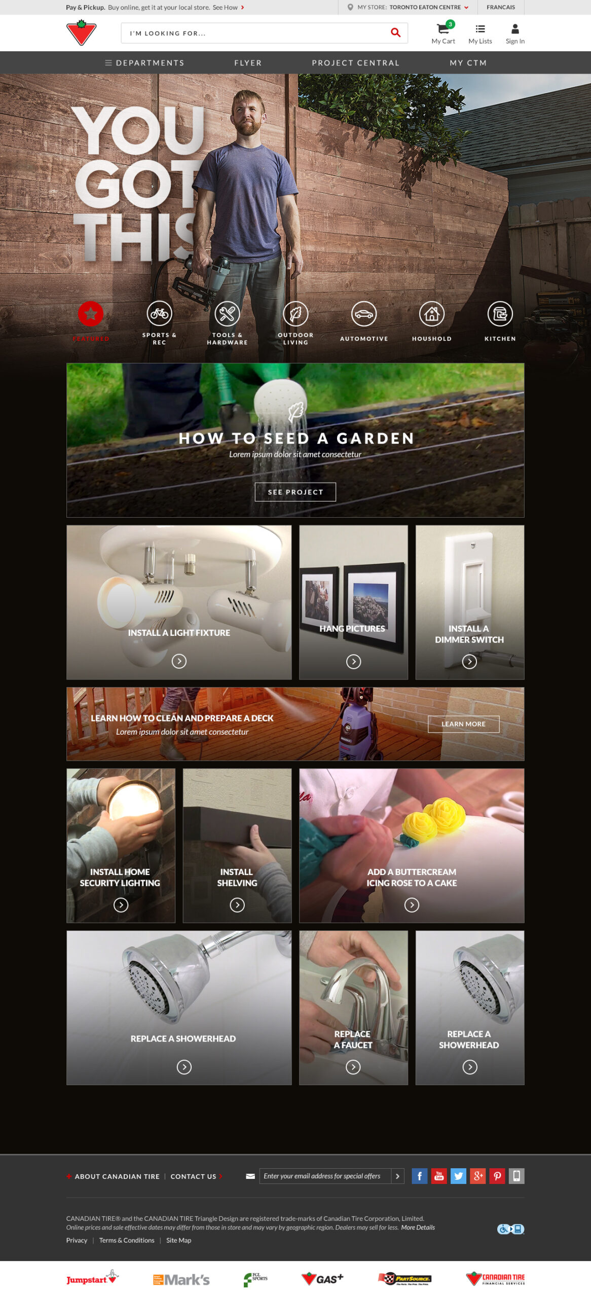
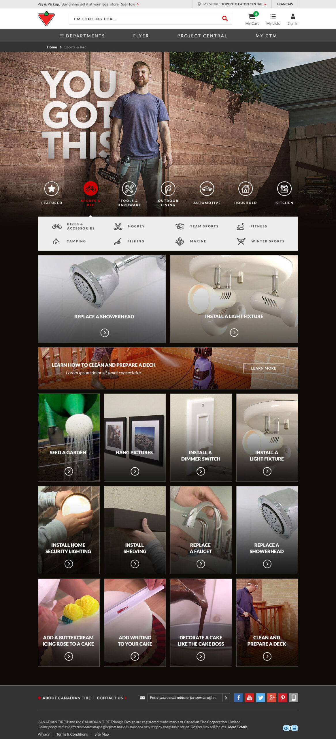
A responsive site design that will scale based on screen sizes on desktop and tablet. When the user selects a category within the navigation, subcategory navigation drops to help filter the different HOW-TOs. Users are then able to select different how-tos that display underneath.
As the how-tos are pulled into the results based on popularity and trend of the season, different cover image sizes are created to fit into the necessary content boxes.
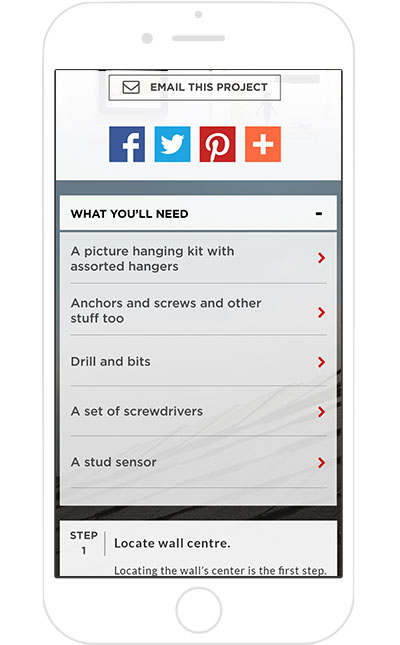
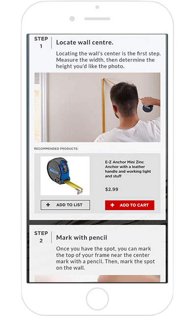
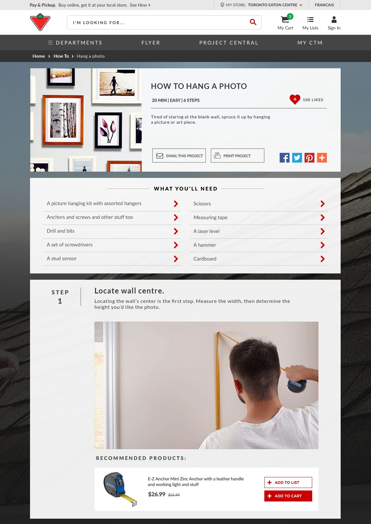
The how-to page will showcase all the necessary steps and recommended products to have the job done. Each step showcases the necessary product/tool and allows the user to add them to their shopping list (for comparison, viewing purposes, later use) or to their cart for check-out.
MOBILE DESIGN
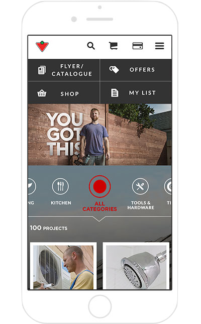
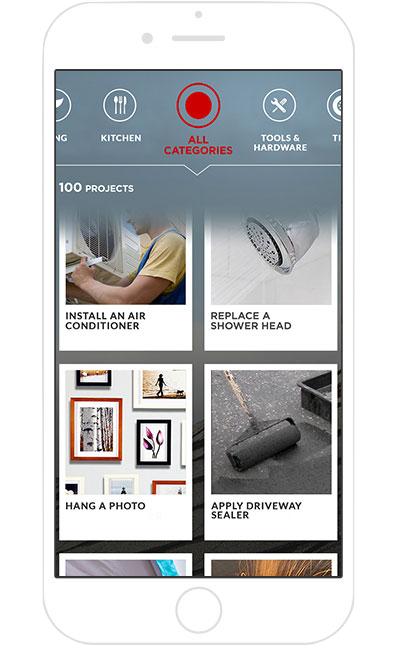
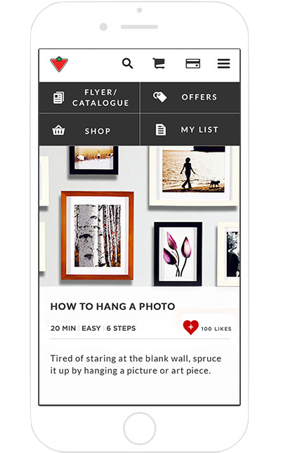
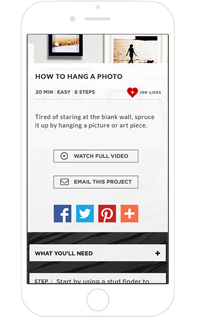
As the site is responsive, it has a separate mobile design to scale to when it detects a mobile device is being used to view. This helps to ensure that information is scaled and presented properly on mobile devices as well as provides an intuitive user experience.
